Logo & Frontend Web Design
What About Wiki
Minimalism can expand possibilities with a limited set of visual tools and budget. With a bold typographic approach and limited color palette, I designed a dynamic logo and website for What About Wiki.
༄
“When a client has a tight budget, I typically recommend typographic logos. They (generally) take less time to develop and, depending on the business, can be preferable to a more graphical logo.”
Seth Barham
Graphic & Web Designer
Project Details
Type: Logo and frontend web design
Skills: Logo design, web design, vector graphics, photo editing & composition, social banners
Tools: Apple MacBook Air, Adobe Illustrator, Adobe Photoshop, Squarespace, CSS
Goal: Design a minimalist logo and website for a content marketer.
Challenges: Create something visually interesting with a limited budget.
VISIT THE WHAT ABOUT WIKI WEBSITE
༄
VISIT THE WHAT ABOUT WIKI WEBSITE ༄
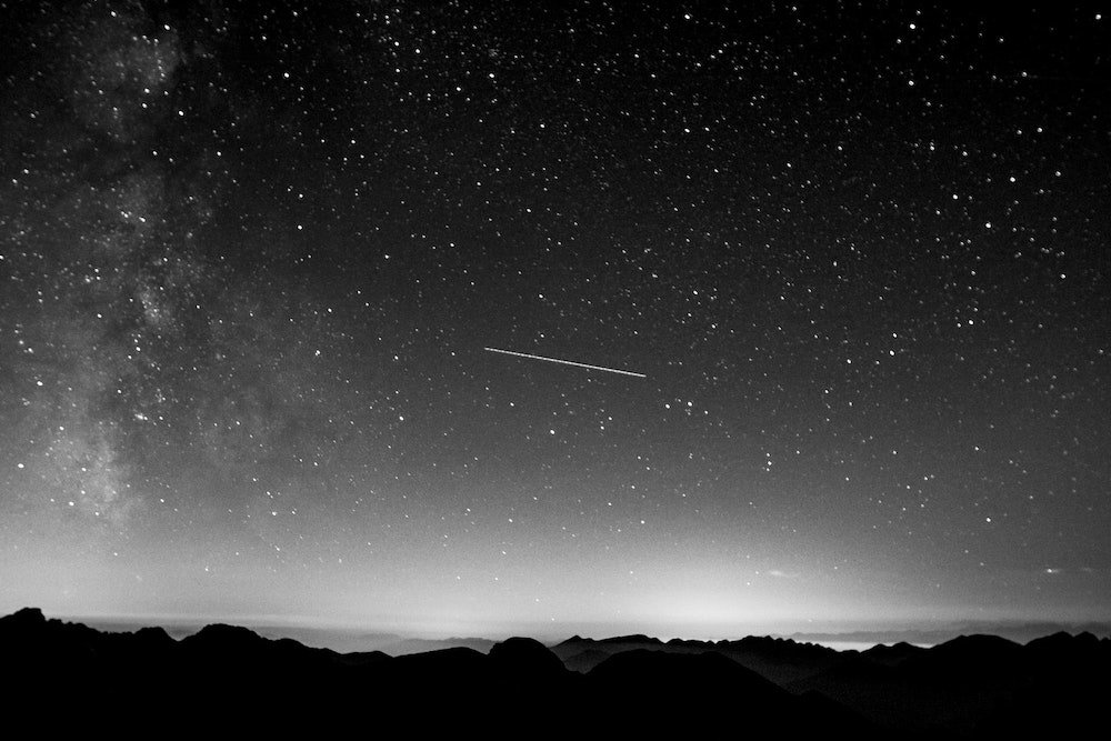
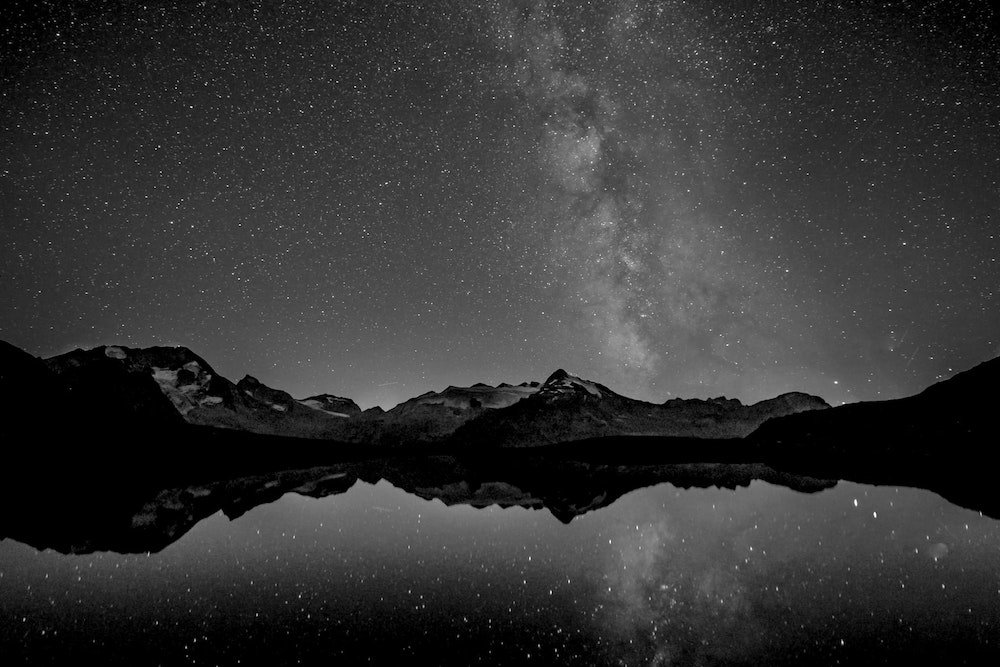
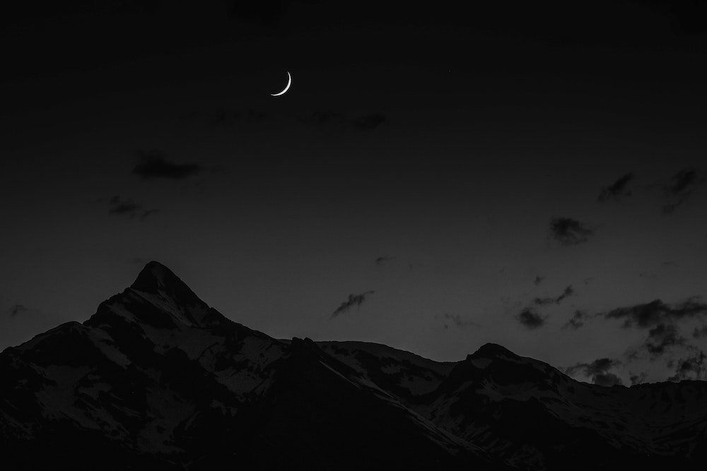
Typographic logos are great for budget branding.
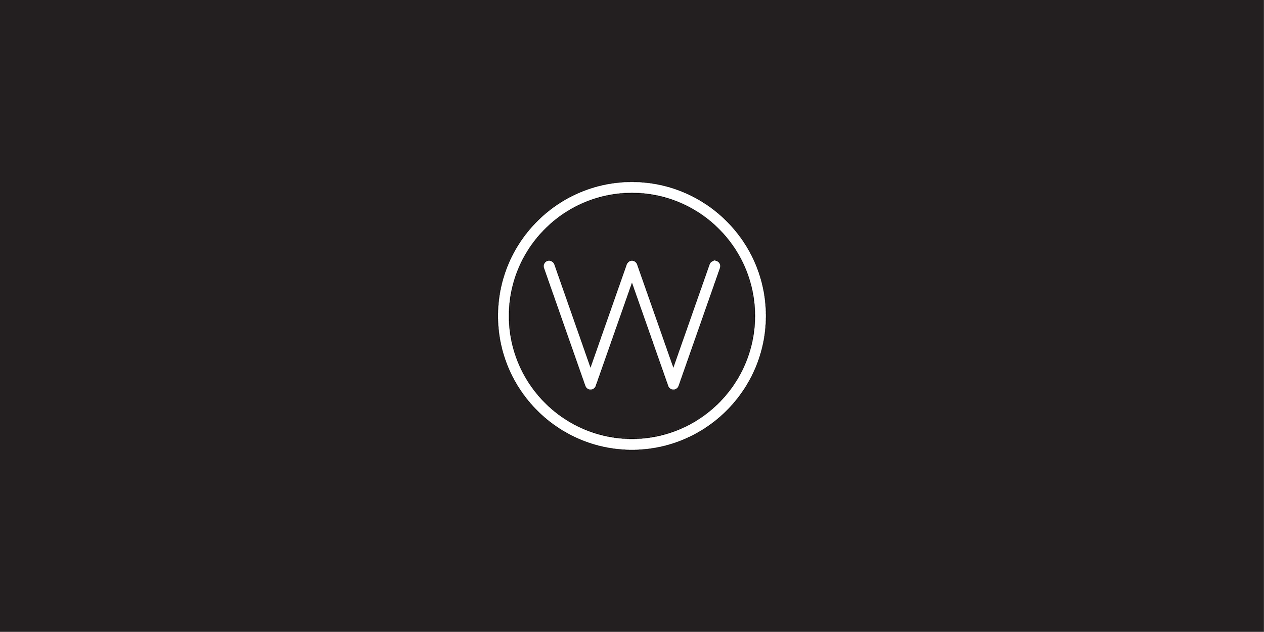
When a client has a tight budget, I typically recommend typographic logos. They (generally) take less time to develop and, depending on the business, can be preferable to a more graphical logo. Moon is a beautiful typeface by Jack Harvatt that performs well in typographic logos and is an ideal fit for our stellar hi-res backgrounds used in social media and throughout the website. The downsized lettermark version of the logo functions well as a social media icon, but the “W” also works as a callback to the client’s primary service - writing Wikipedia articles.
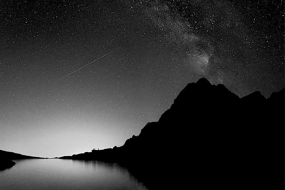
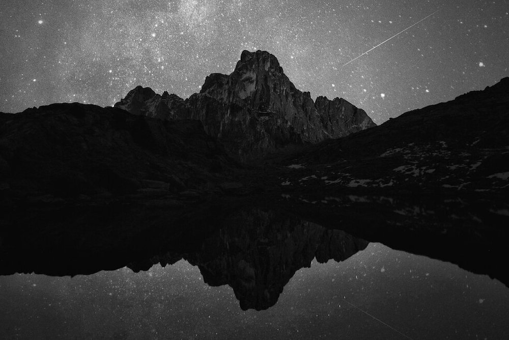
Hi-res images take this project to the moon.
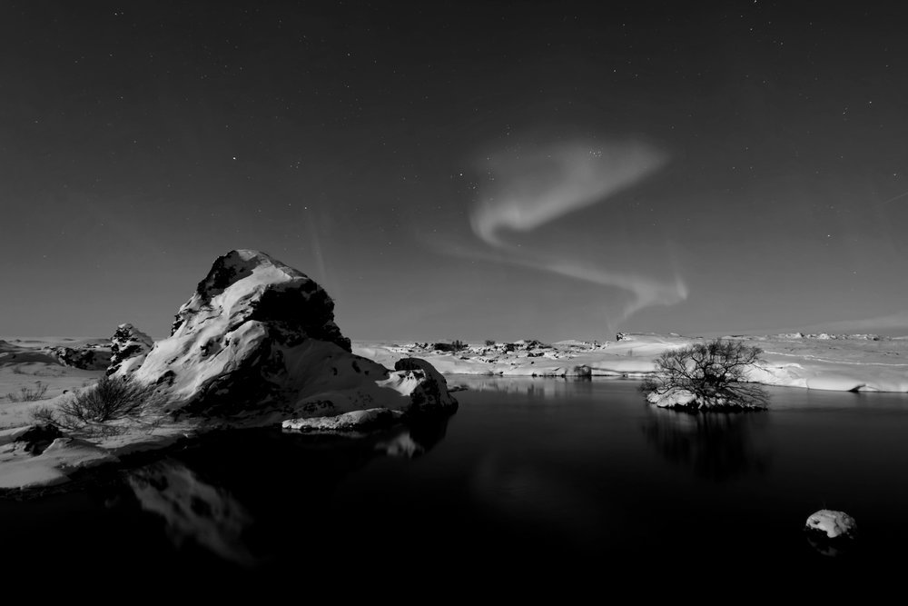
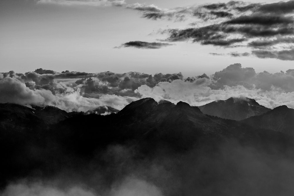
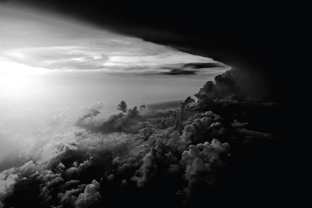
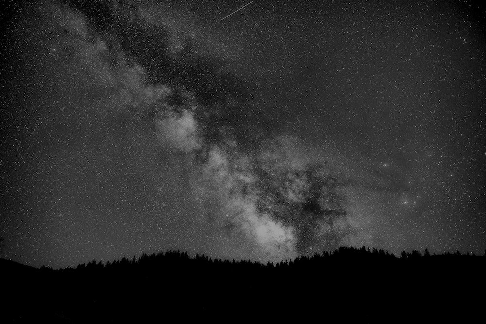
Not only does the high contrast between our two dominant colors increase readability on a text-heavy site, but it is also a nod to traditional forms of letterpress like newsprint. To further the newsprint vibes and mesh our colors with something that ties in thematically with the client’s service, I compiled some hi-res images in grayscale that mirror the vast breadth of information available through Wikipedia. Free stock image resources like Unsplash are great low-cost solutions for quickly finding royalty-free, hi-res images for your projects.
Social media banners for days!
The two logo options and an arsenal of hi-res grayscale images provide endless combinations for eye-catching social media banners. This formula has unlimited potential. The subject of the background photos can vary widely depending on outreach targets and goals. The futuristic pairing of the Moon font on high-contrast grayscale images is itself part of the brand identity. Alternatively, the lettermark on the deep gray background creates a scaled-back premium look.
Parallax scrolling adds depth to this website design.
The clean panels of text reveal the hi-res image banners as the user scrolls. This parallax scrolling effect adds depth and perspective to prevent a text-heavy site from feeling flat and dry. Apart from looking nice, the banners function as section dividers on our one-page site. The reader must feel like they are making progress when a site has this much text on a single page, or they will find the page intimidating and quickly click away. The stacked layout organizes the information into manageable chunks.
