Illustration & Frontend Web Design
Birthing with B
A website with simple illustrations and an inviting palette encourages Batsheva’s customers to take their first step on a joyous natural birthing journey with anticipation rather than fear.
༄
“Seth really took my idea and brought it to life. He took my vision and worked with me for as long as it took to settle on something that truly represented me and my business.”
Batsheva
Owner, Birthing with B
Project Details
Type: Frontend web design for a natural birth coach
Skills: Web design, CSS, illustration, vector graphics, iconography, on-page SEO
Tools: Apple M1 MacBook Pro, Adobe Illustrator, WordPress CMS, Elementor, Yoast
Goals: Develop calming illustrations and a user-friendly website for a service-based business.
Challenges: Illustrating in a style that matches an existing logo.
VISIT THE BIRTHING WITH B WEBSITE
༄
VISIT THE BIRTHING WITH B WEBSITE ༄
Visual storytelling connects with your website visitors.
Batsheva (or B) is a peaceful birthing coach that needed a hand bringing her brand and website to life. I was more than happy to create something unique that would embody the calm she strives to bring her clients amidst their pregnancy and natural birth. Batsheva was excellent to work with, and the project felt like a collaborative effort with valuable direction and feedback from the client but also trust in my intuition and abilities as a designer. You can’t ask for a better environment in this field!
It’s not uncommon for clients to already have a logo when they approach me with their website project. Batsheva also had a logo that she was pleased with, so I used it as the scaffolding to start building out the rest of the website styles.
My challenge was to create something that meshes with an existing logo’s style without mimicking it completely. It’s very important that I have room to add my personal touch to a project. The logo gives us a few key points we can bring over to the other styles: soft colors, dark outlines for contrast, and a character we can use in other illustrations.
Color psychology matters in branding and web design.
I sampled the color swatches for this project directly from the logo using the eyedropper tool. Batsheva and I had regular communication to hash out the final palette. We settled on a light peach orange and light pink, balanced by a bolder coral pink that gives us room for contrast in the illustrations. The main white background of the website, along with these soft color blocks and accents, work together to inspire a feeling of calm in Batsheva’s potential clients.
Creating this welcoming, safe feeling extends beyond color choices. The typeface also goes a long way in setting the tone of a website. As a rule, serif fonts are usually considered more traditional versus the sleek, modern feel of sans serif fonts. Crimson Text and Lora were the perfect choices for a heading/body text pair that matched this project's natural and soothing themes.
Simple illustrations create visual continuity for Birthing with B.
With the basic site styles decided, it was time to break out my digital pen and paper for my favorite part of any design project: illustration. The palette is mostly made of soft colors, so before I even knew what I was going to draw, I knew I wanted to use the same dark outlines as in the logo to separate these colors and add some contrast and depth.
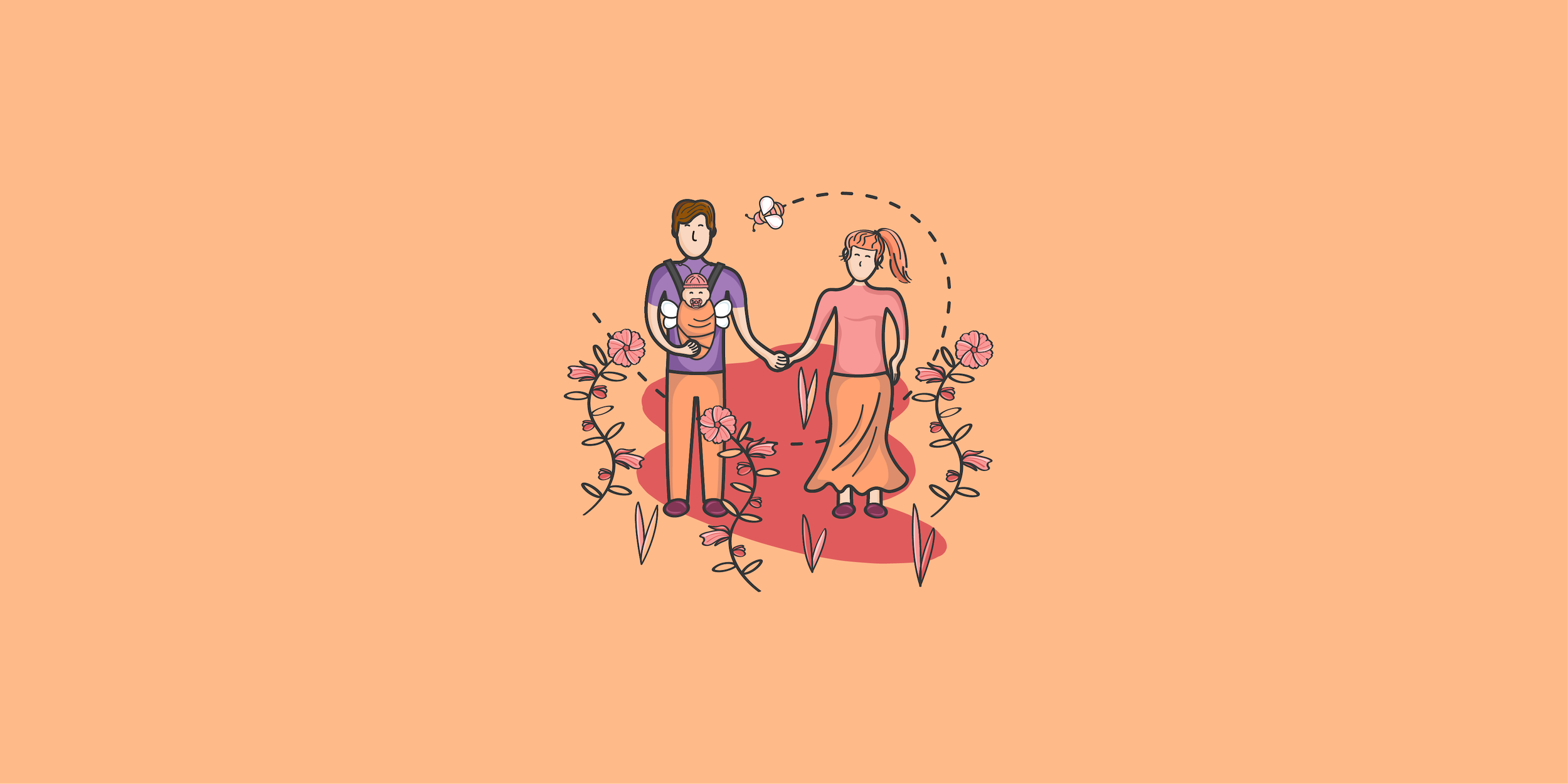
For the theme? Well, never waste a good pun. It seemed like a natural choice to everyone that a bee would be involved somehow. Makes sense, right :) And bees need flowers (and flowers need bees)! I chose the hollyhock for its fertility symbolism that goes back thousands of years. These visual accents from our natural world help create an appropriate setting for the natural birthing experience that B’s clients are seeking.
Once the setting is established, it needs characters. B strives to help rewrite the painful and fearful narrative that many clients have in their heads about natural birth, instead weaving a joyous tale at every stage. We both wanted to represent the client as the character in this story. Using the logo as a base, I drew the expectant mother, the newborn, and the father, all tied together in a continuous flowing illustration by the bee's flight path.
Buns for those with buns in the oven.
Like I said before, seize on a good visual pun when it presents itself. In this case, the pun is a bun. Batsheva had the great idea to do something with buns to play on the “bun in the oven” idiom. I came up with two different concepts, one with East Asian bao buns and another with more Western-style buns. The second concept won out, and I applied this design as an icon and a background for the website’s Bundles of Joy Packages section.
Simple color blocks effectively chunk a website’s information.
With all the assets completed, it was time to play Tetris with them using the OceanWP theme for WordPress. The free version of this theme has plenty of customizability and is easy enough to code CSS changes for when you need to push it further. Minimalism shines yet again in this project—the last thing we wanted to do is overwhelm clients with too much information or visual clutter when they may already be anxious about their upcoming delivery.
As the user scrolls, these color blocks and other design elements slide in to create a more dynamic experience. A well-designed static webpage is fine as long as it delivers information effectively, but adding some simple animations can go the extra mile to keep the user engaged and gives them a sense of progression as they move through the site. Every page has a clear point of contact—a crucial element for service-based businesses that depend on gaining new clients.

What did Batsheva think?
“Seth really took my idea and brought it to life. He took my vision and worked with me for as long as it took to settle on something that truly represented me and my business. I appreciated his incredibly responsive and thorough answers to my questions. Not least of all, the designs are absolutely gorgeous! I would work with Seth again in a heartbeat and recommend him to others as well.”
Batsheva
Owner, Birthing with B