Brand Design & Product Launch
Sunbeam Wireless F1 Horizon
After the successful debut of the F1 Pro, I designed another range of vibrant and playful vector assets to help Sunbeam Wireless brand and launch their latest simple flip phone device, the F1 Horizon.

༄
“I especially love his illustrations and iconography. We highly recommend him. He's done a great job and we've had a lot of fun in the process. Do yourself a favor and let Seth help you accomplish your branding needs.”
Sterling Martin
CEO, Sunbeam Wireless
Project Details
Type: Brand design & product launch
Skills: Illustration, vector graphics, brochures, print ads, frontend web design, CSS, packaging design, SEO, product wireframes
Tools: Apple M1 MacBook Pro, Adobe Illustrator, Wacom Intuos Tablet, WordPress CMS, Elementor
Goal: Develop a complete range of brand assets for the F1 Horizon, from the packaging illustration to the webpage design.
Challenges: Producing a comprehensive package of branding deliverables on a tight timeline.
VISIT THE F1 HORIZON WEBPAGE
༄
VISIT THE F1 HORIZON WEBPAGE ༄

Another full suite of brand assets
The fine folks at Sunbeam Wireless have been incredible clients to work with, starting in 2020 when they approached me to build their initial website and brand their flagship F1 flip phone. The F1 was a big success, making a splash in the growing dumbphone community where people are seeking more practical devices without the time sink of the endless scroll.
Not long after I helped with the launch of their rugged F1 Pro flip phone, it was time to brand a more economical version of the phone — the F1 Horizon. Like the Pro, this project requires a corresponding set of assets — illustrations, icons, website design, packaging design, tech spec brochures, and website design — but in a different setting and color palette.


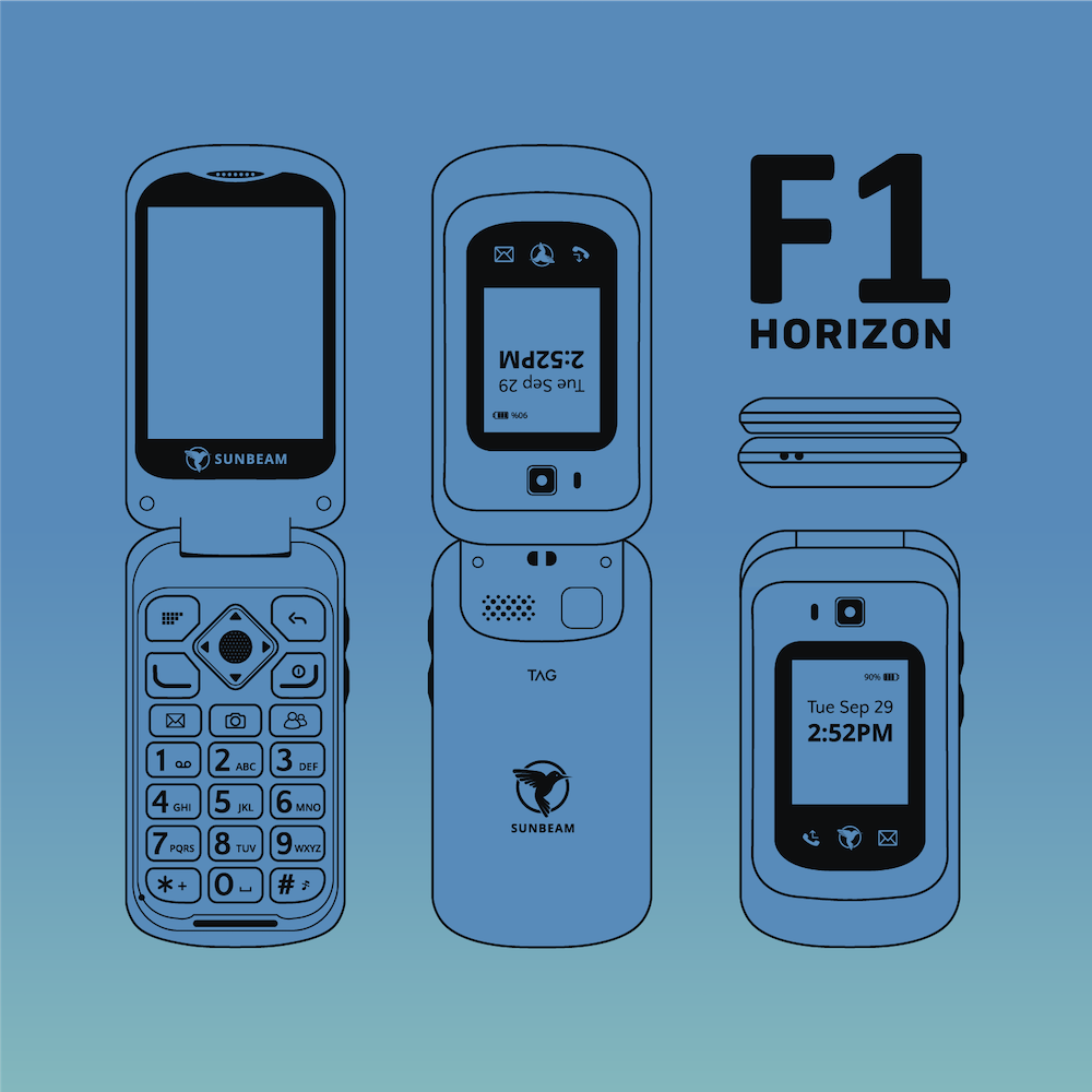
Detailed vector wireframes of the F1 Horizon
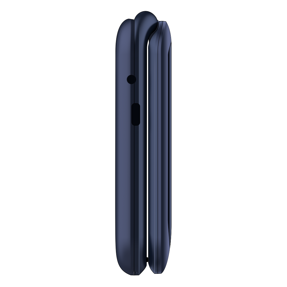
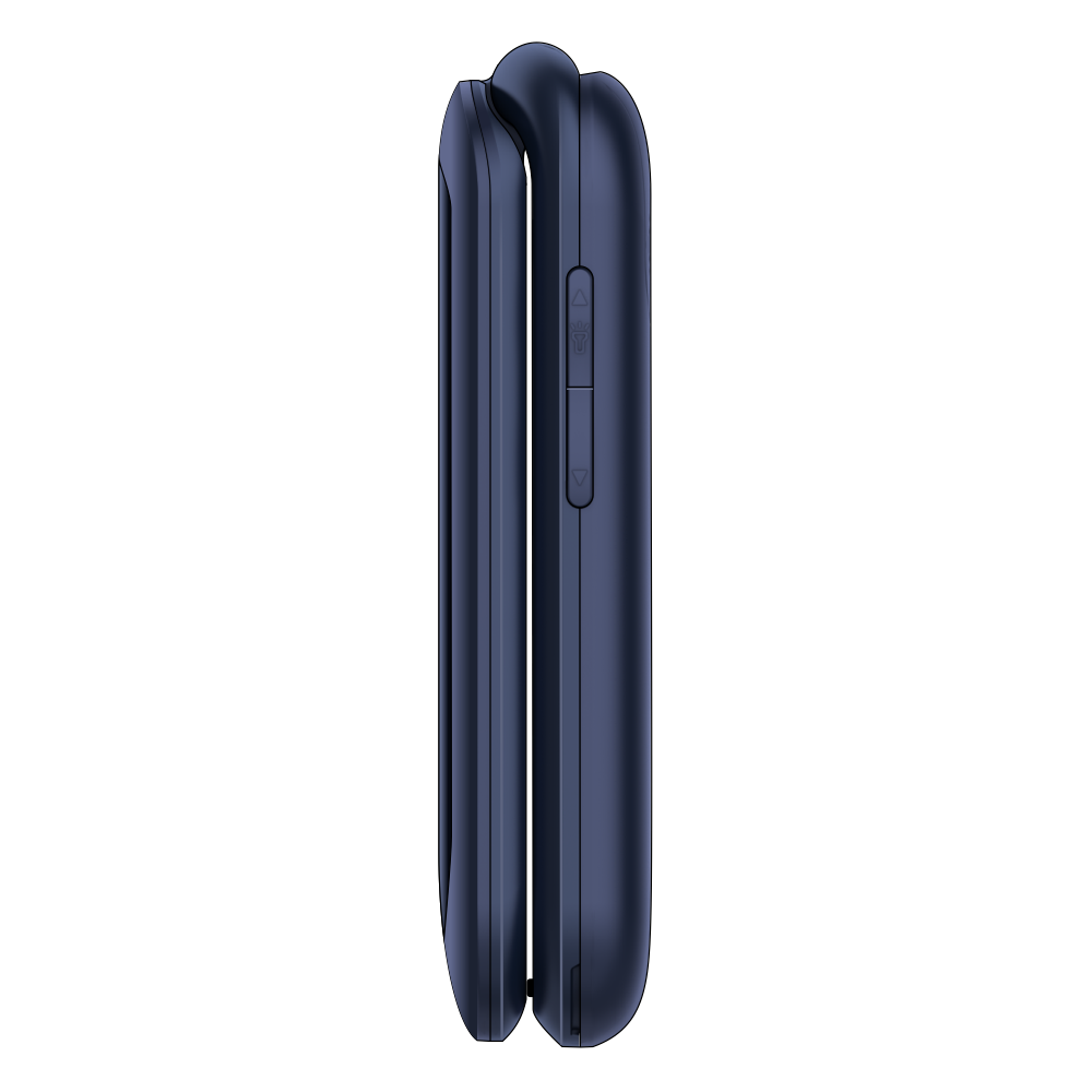
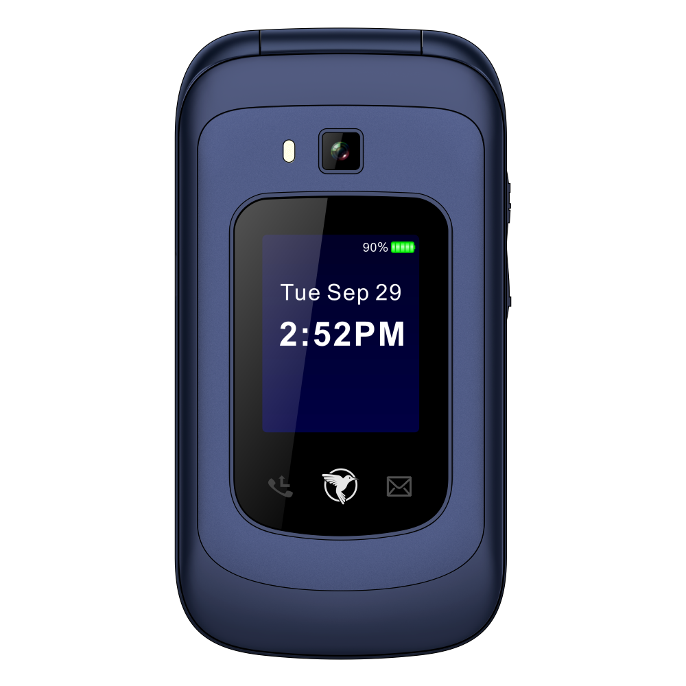
Everything starts with the product and how it’s represented among the other creative assets. I used Adobe Illustrator to draw a detailed wireframe based on photos of the Horizon. Three levels of detail — outlines, black, and color — provide resources for different applications. For example, the outlines are used on diagrams on the spec sheet, while the full-color version is used on the website since it meshes with the simple and playful vector style of the other assets.


I present possibilities to the buyer through simple, vibrant illustration.
The illustration for the more rugged F1 Pro device was set in a forest at night — perhaps a more intimidating environment where you’d want a water-resistant device that can take some tumbles. By contrast, a more easygoing daytime scene seemed more appropriate for the Horizon, especially considering the name of the phone.
The premise for most of my Sunbeam illustrations is: where and what would I be doing if I wasn’t on the couch doomscrolling? Enjoying an afternoon at the park ranks high on the list. Set against a cityscape backdrop, you can notice slight hints of different activities one would do in a park — a football, a coffee cup, a bike, a picnic cloth, etc. And since this is the Horizon, that’s where the sun is, creating a sky gradient just like we have with the Pro at moonrise.
Colorful songbird icons represent the F1 Horizon models.
While the Pro’s eight models with different feature sets were named after different trees, the Horizon’s models took on names of songbirds. Leaves are easy to make symmetrical with a consistent green palette — not so with different species of birds, nor was it ever a consideration on my part. I intentionally celebrated the different colors and shapes of the birds as I drew them in Illustrator but still tried to keep the overall style of the icons fairly consistent.
Packaging creates the opportunity for a 3D visual experience.
A simple white box works for some dumbphone brands. Not ours. The lively centerpiece illustrations for the F1 Pro and Horizon are the epicenters for brand cohesion, and that extends to the packaging design for the devices. The main park illustration wraps around the sides of the box. The gradient of the sky background darkens and continues to its bluest hue on the top of the box, where the wireframe rests against a backdrop of clouds. The green grass at the bottom of the illustration extends to the bottom of the box. The layout of the illustration creates a 3D experience that will give the customer pause before throwing it away.

The spec sheets showcase all of the F1 Horizon brand assets.
I used the full-color vector wireframe at the top of the first page since the blue color of the Horizon device looks so good against the darker end of the sky gradient. Below, a matrix with the bird icons differentiates the different feature sets of the Horizon models. The height of the document allows the gradient to be extended, resulting in stronger sunset hues. The wireframe outline diagram takes up the first portion of the second page, with icons from some of the items in the park illustration highlighting the tech specs.
I use a dynamic palette across Sunbeam’s website.
If you go to the Sunbeam website and click through the site, you’ll see that the palette darkens from the homepage to the Horizon to the Pro. This effect took some CSS magic to pull off since it required multiple navigation bars, link styles, etc. Despite the shifting palette, the clean, identical layout of the Pro and Horizon pages acts as the connective tissue that maintains cohesion amidst such color variation. Visit the site yourself for a full look-see of how all these brand assets came together!

What the folks at Sunbeam Wireless had to say…
“We needed a graphics designer to help us build our brand identity. After reaching out to some firms that had mediocre "packages", we stumbled across Seth while looking for minimalism in design. We had some notions about what we wanted, but it quickly became apparent that Seth was highly skilled, so we gave him free reign to let his creative juices flow. We couldn't be more happy with the results! I especially love his illustrations and iconography. We highly recommend him. He's done a great job and we've had a lot of fun in the process. Do yourself a favor and let Seth help you accomplish your branding needs.”
Sterling Martin
CEO, Sunbeam Wireless