Brand Design & Product Launch
Sunbeam Wireless F1 Pro
Sunbeam Wireless entrusted me with developing a vibrantly minimalist brand design to launch the F1 Pro, the rugged version of their modern flip phone that helps people do more with less screen time.

༄
“We had some notions about what we wanted, but it quickly became apparent that Seth was highly skilled, so we gave him free reign to let his creative juices flow. We couldn't be more happy with the results!”
Sterling Martin
CEO, Sunbeam Wireless
Project Details
Type: Brand design & product launch
Skills: Illustration, vector graphics, brochures, print ads, frontend web design, CSS, packaging design, SEO, product wireframes
Tools: Apple M1 MacBook Pro, Adobe Illustrator, Wacom Intuos Tablet, WordPress CMS, Elementor
Goal: Develop a complete range of brand assets for the F1 Pro, from the packaging illustration to the webpage design.
Challenges: Making the radically different nighttime palette feel like a natural extension of the overall brand.
VISIT THE F1 PRO WEBPAGE
༄
VISIT THE F1 PRO WEBPAGE ༄

Marketer, illustrator, designer, web guy
The fine folks at Sunbeam Wireless have been incredible clients to work with, starting in 2020 when they approached me to build their initial website and brand their flagship F1 flip phone. The F1 was a big success, making a splash in the growing dumbphone community where people are seeking more practical devices without the time sink of the endless scroll.
When it came time to upgrade their initial offering with an improved, more rugged device built with customer feedback in mind, Sunbeam asked me to take charge of developing a complete range of brand assets for the F1 Pro. The scope of this project covered original illustrations, icons, website design, packaging design, tech spec brochures, website design, and print ads for magazines.

Let’s start with the product.
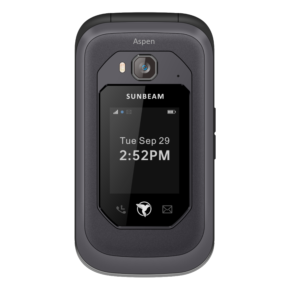
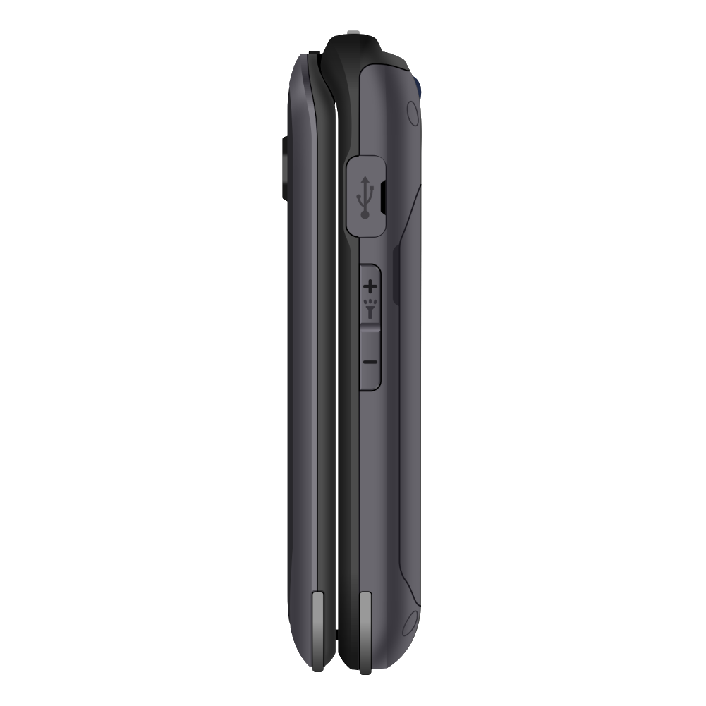
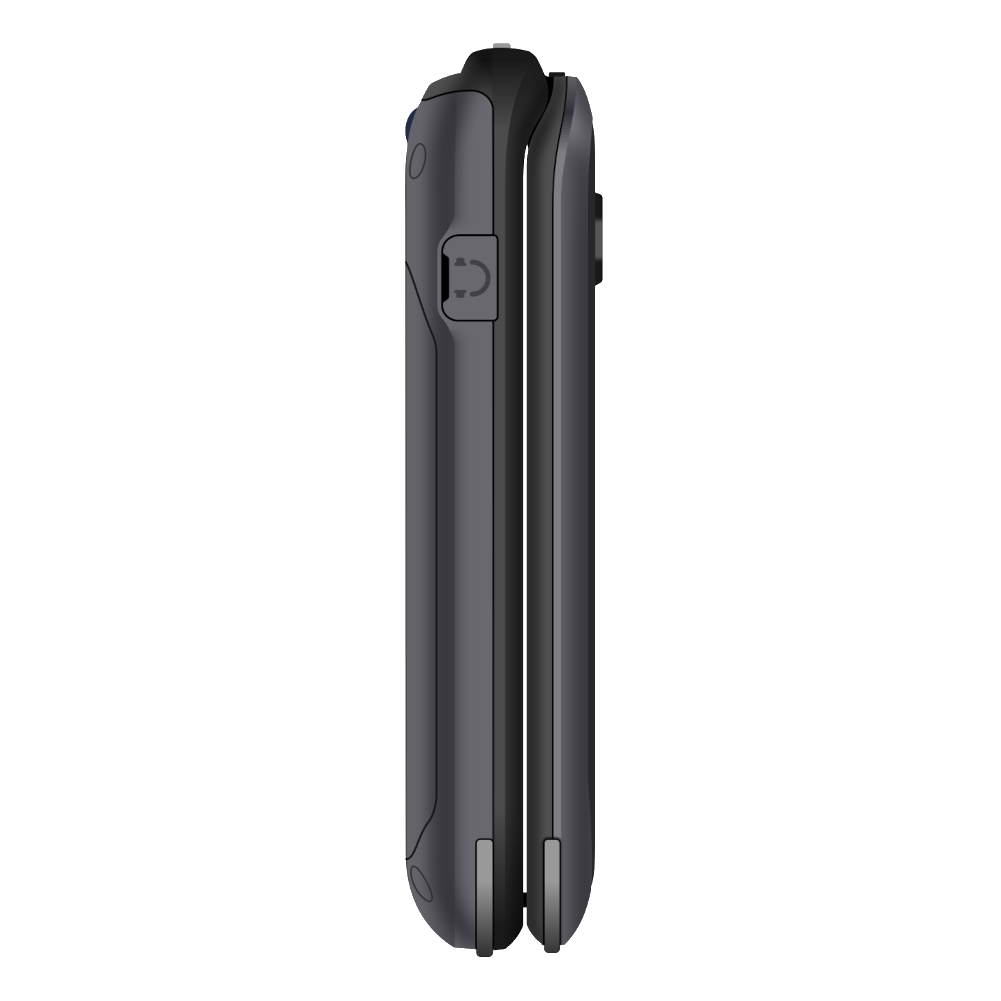
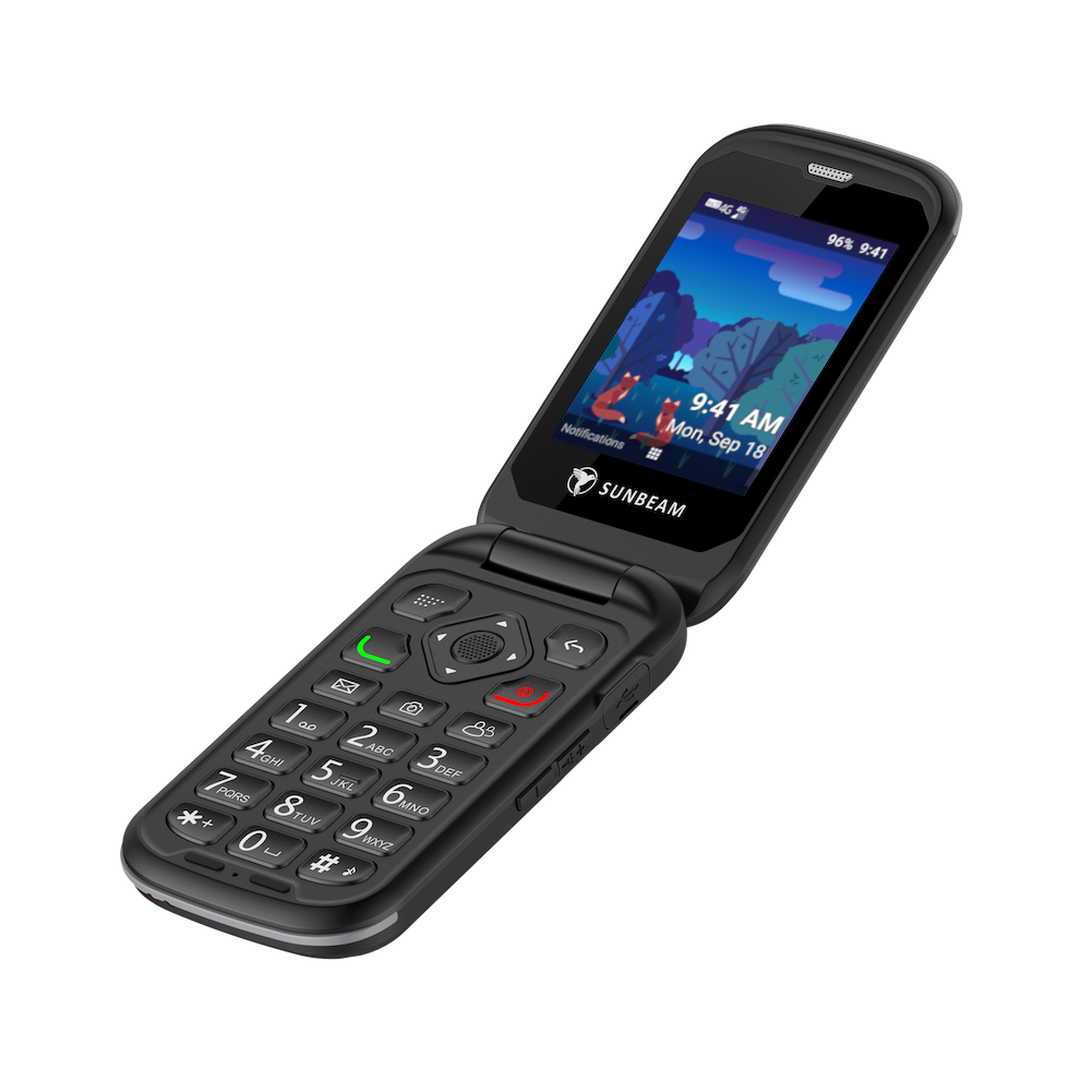
The main premise of the F1 Pro is that it’s more rugged, water resistant, dust resistant, and has a larger battery than Sunbeam’s original F1 device. As with previous models, I began with drawing the wireframe based on manufacturer photos in Adobe Illustrator. Getting a feel for the physicality of a tangible product is important. This wireframe would also feature on many assets, from vector graphics on the website to diagrams on spec sheets. Each of the three wireframes offers a deeper level of detail.


Minimalist design doesn’t have to be colorless and sterile.
From the very start with Sunbeam Wireless, we both wanted to differentiate the brand from others in the simple phone space that rely on the same black/white/grayscale palette that some consider a prerequisite for minimalist design. It’s possible to achieve simplicity with a vibrant coat of paint, too. The whole message of Sunbeam is that simple phones help people live fuller lives, and color is an important element to successfully express that.
Our vehicle of choice for this splash of color was simple vector illustrations of various environments that people might find themselves in, living fuller lives with less screen time. The environment chosen for the Pro was a dense forest at twilight since each of the Pro’s eight different model names was based on a different tree species. As with the wireframes, I designed the illustration in Illustrator, working with a mostly cool and dark palette to distinguish the F1 Pro from the Horizon, Sunbeam’s other new flip phone device.
Seeing the forest for the trees
Eight different models of the F1 Pro have a different set of features, from the fully-loaded Aspen to the bare bones talk-only Cedar. I designed simple leaf icons to match the tree names of these models, and if you squint at the illustration, you will find some of these trees in the forest. The leaves follow the same color palette as the trees in the foreground.
I aimed to design packaging that users wouldn’t throw away.
Good design shouldn’t end at marketing and selling. The customer’s unconscious recognition of strong brand cohesion should follow through all the way to unboxing. I wanted to design a box for the Pro that a Sunbeam customer wouldn’t immediately put in the trash. The top of the packaging features the vector wireframe of the Pro against a night sky at the darkest end of the illustration’s background gradient. The remainder of the forest scene wraps around the sides of the box when folded and should be completely flush to match the illustration on other materials.

The Pro’s design elements come together on the spec sheet.
Putting together the spec sheet for the Pro was a deeply satisfying experience because it allowed me to feature all the design assets I worked so hard on in a tidy package. The main illustration forms the background, starting at the bottom with a gradient sky that darkens into a starlit sky at the top. The icons that represent the models are neatly arranged in a matrix that differentiates the features of each phone. The wireframe is prominent both as a vector illustration of the phone on the first page and a detailed outline diagram on the second page. It’s a piece I can truly look at and feel a great sense of pride.
Monthly ads in PCBE Magazine
Each month, I coordinate with the Sunbeam team to put together an ad for their devices that runs in Plain Communities Business Exchange, a magazine that serves Amish and Mennonite communities. These communities desire a lower-tech device like the Pro to use only as a tool. The top half of each ad we run features a different feature of the phone, while the bottom half follows the same layout as the spec sheet to showcase the different features of each model.
The F1 Pro webpage proves minimal web design does not equal boring.
I developed the frontend design of the Sunbeam website on WordPress, mostly using Elementor and the OceanWP theme with a healthy amount of custom CSS sprinkled here and there. The F1 Pro page puts all of the vector design assets front and center, flowing from the dark sky end of the gradient down to the illustration in the header. A carousel of high-quality images of the Pro points to a download link for the spec sheet, and below that is an icon array of the different models linking directly to the product pages. Visit the page for the full experience, and possibly consider grabbing a Pro for yourself!

What the folks at Sunbeam Wireless had to say…
“We needed a graphics designer to help us build our brand identity. After reaching out to some firms that had mediocre "packages", we stumbled across Seth while looking for minimalism in design. We had some notions about what we wanted, but it quickly became apparent that Seth was highly skilled, so we gave him free reign to let his creative juices flow. We couldn't be more happy with the results! I especially love his illustrations and iconography. We highly recommend him. He's done a great job and we've had a lot of fun in the process. Do yourself a favor and let Seth help you accomplish your branding needs.”
Sterling Martin
CEO, Sunbeam Wireless