Onebag: Adobe Capture
A holiday or sabbatical can be a great source of inspiration when we feel our wells of creativity running dry. The change of scenery, cuisine, culture, or routine is usually enough to replenish that well and keep us going for another few months. Writers write and painters paint, but what specifically can a graphic or web designer take away as tangible inspiration for their next project? Well, there’s an app for that. Today, I’m going to tell you why you shouldn’t board that plane - or leave your house ever again - without Adobe Capture installed on your phone.
Design assets as travel souvenirs
How can we quantify inspiration? It’s a bit ethereal and hard to put our hands on to really channel it and produce something from it. I am particularly bad about having something come to me, telling myself that it’s such a great idea that I won’t forget it, stupidly not writing it down, and winding up with nothing. I’ve gotten better at trying to capture these ideas that float away if we’re not careful. Adobe Capture has been a great tool for capturing color palettes that inspire me when I’m out and about.
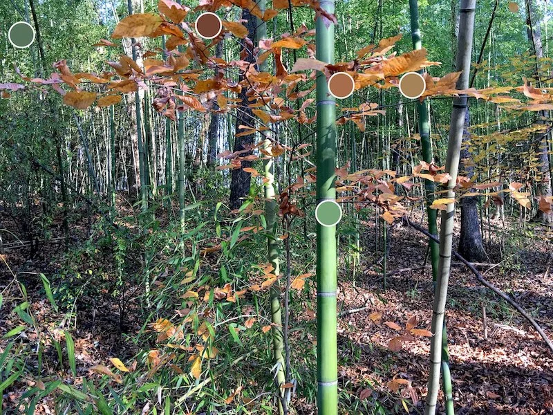
Any designer knows that finding the perfect colors that meet client specifications, work well together, and fit with the current trends can take hours if not days to nail down. While clicking through a color wheel works for some, I prefer to source color palettes from photos of my travels. After all, one of the main things that inspire us to reach for our phones and take a snap is a color composition that we find naturally appealing.
“Adobe Capture allows you to build up a library of assets by just taking a photo, whether it’s a temple in Tibet or a particularly photogenic breakfast.”
Taking the photo is the easy part. Now I have to load it into Photoshop or Illustrator and painstakingly use the eyedropper tool to select a palette of 4-5 colors that can work well together in a project. This can take some of the fun away from venturing out with your camera to hunt down some inspiration. No more! Adobe Capture (which did not sponsor this post) allows you to build up a library of design assets by just taking a photo, whether it’s a temple in Tibet or a particularly photogenic breakfast.
Using Adobe Capture to source colors from photos
There are actually several apps out there for creating color palettes from photos - PANTONE has one - but I found that Adobe Capture was the easiest to use and its ability to sync with other Adobe products makes it the clear winner for anyone who uses their desktop programs. If you don’t already have a Creative Cloud account with Adobe, you’ll need to create one to use the app. It’s quick and free, so don’t let that deter you.
Once that’s done, open the app, which will open your camera in Color mode. I will mention the other modes briefly, but I found the Color mode to be the most useful tool as a graphic/web designer. With the camera active, you will notice five circles darting across your screen until they zero in on certain colors in the frame. The current color palette is displayed at the top (portrait) or on the lefthand side (landscape). You can freeze or unfreeze a certain palette by tapping the screen.
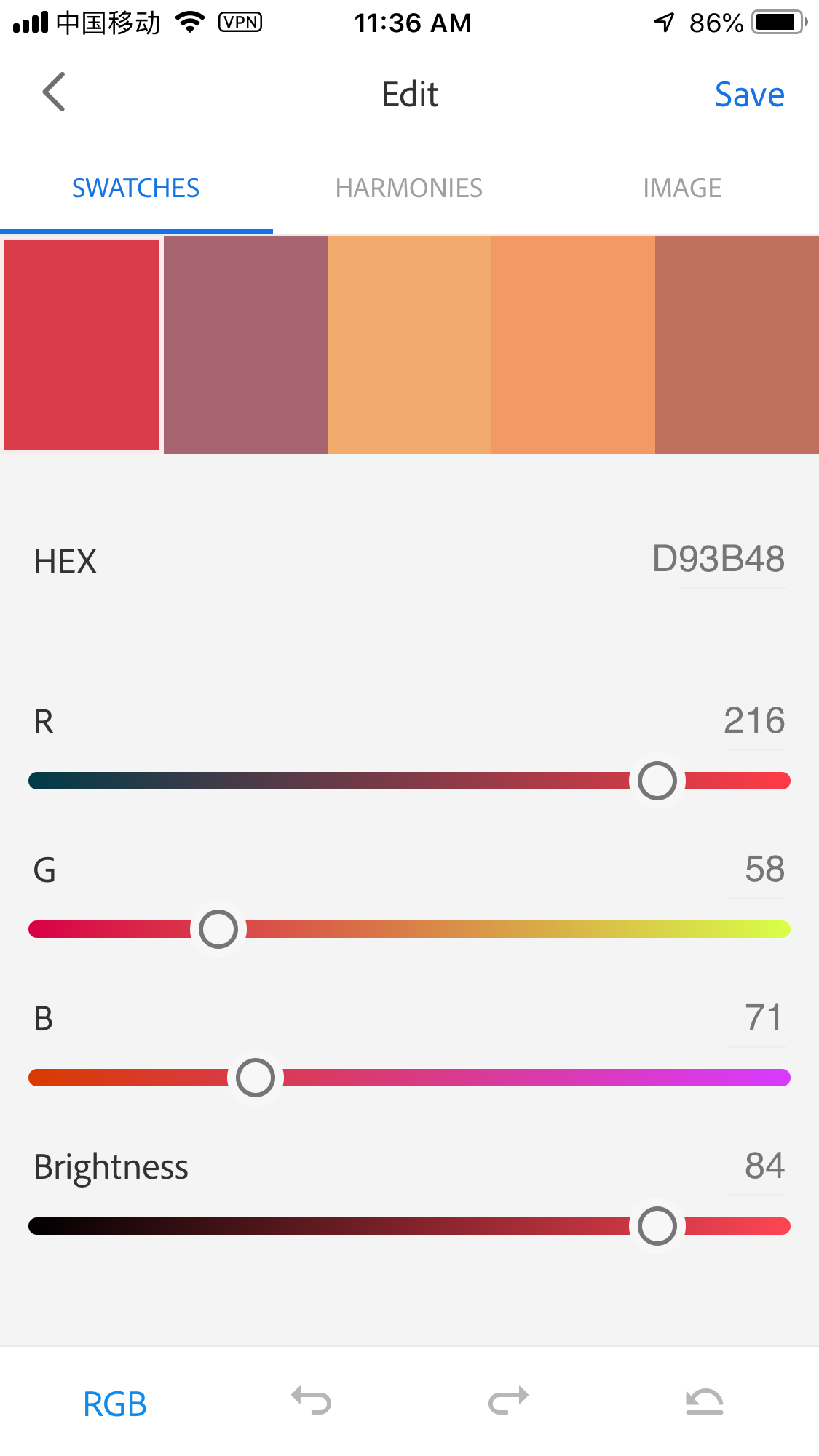
Once you take a photo, you can edit the palette by toggling the sliders for each individual swatch, experiment with harmonies on a color wheel, or fine-tune your color selection on the image. The swatches panel allows you to work in the RGB, CMYK, LAB, or HSB color modes and displays the HEX code. The harmonies panel is particularly useful for automatically selecting color groupings such as analogous, complementary, or monochromatic.
Once you’re happy with your selection, tap Save. You can always go back to an asset in your Creative Cloud library to tweak it further. You’re able to grab palettes from any photo saved to your camera roll, which means that you’ve already lost several hours to your life poaching assets from old photos if you’re anything like me.
Other useful asset modes
I mostly use Adobe Capture to grab color assets when I’m out and about, but the app has several other useful modes worth mentioning.
Patterns - This feature applies a trippy kaleidoscope effect to your image. You can save the result as a raster or resizable vector to use as a fill or texture in Adobe’s desktop programs.
Shapes - Turn sketches or high-contrast photos into vector shapes. This is a great tool for those who prefer to sketch something down on paper rather than use a digital tablet.
Brushes - Source texturized brushes from your photos to paint in Photoshop, Illustrator, or InDesign.
Type - This is another favorite of mine in the app. If you see a font that strikes your fancy, you can take a photo of it and Adobe will find that font (or one similar to it) in its database.
Materials - Snap an elegant wood grain or dilapidated concrete wall for textures that can be applied to 3D objects.
It’s nice to have something free and useful from Adobe.
Adobe has a long history of developing powerful tools for creative professionals, tools that make the lifestyle of a mobile solopreneur possible. This is nice…but many of these tools - especially now that most of their desktop programs can only be used on a subscription basis - can be prohibitively expensive for small business owners. Without a discount, users are forced to pay $360/year for a single program. Considering many designers need access to four programs or more, it adds up very quickly.
I didn’t intend to end with a rant, so I’ll just say that Adobe Capture is a great little app that you’ll find yourself reaching for quite often when you’re in need of some color inspo. Whether you’ve got a big adventure abroad coming up or you just want to search your old photos for some hidden gems, Capture has got you covered. ◉
Written by Seth Barham


